Project Overview

This project focused on redesigning the mobile checkout experience for an e‑commerce platform. The objective was to reduce cart abandonment and make the purchasing flow faster and easier for users shopping on their phones.
Problem
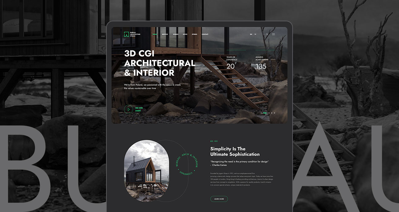
Analytics and user feedback revealed that many users were dropping off during the checkout process. The existing experience contained multiple steps, unclear progress indicators, and unnecessary form fields, creating friction and confusion.
Research
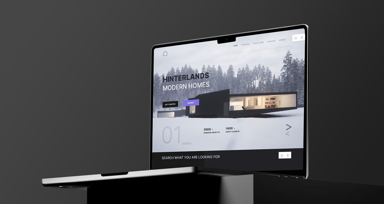
To better understand the challenges users faced, we conducted usability testing and reviewed behavioral data. The goal was to identify the most critical friction points and opportunities for improvement.
Design Process
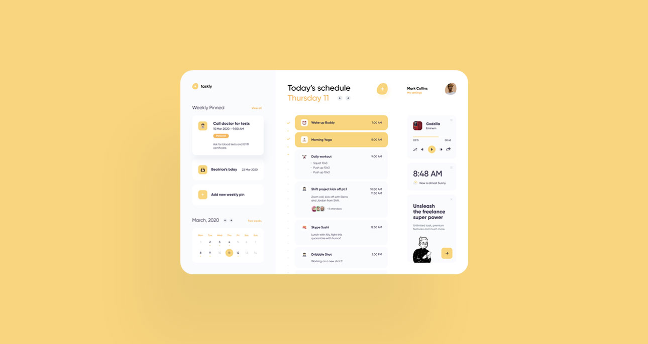
Using insights from research, we explored multiple design directions through wireframes and prototypes. Iteration and testing were key parts of the process to ensure the experience became clearer and more efficient.
This project focused on redesigning a mobile e‑commerce checkout experience to reduce cart abandonment and improve conversion rates. The goal was to simplify the checkout process, reduce friction, and create a more intuitive purchase flow for users shopping on mobile devices.
Solution

The redesigned checkout flow simplified the process into three clear steps and reduced unnecessary form fields. The layout was optimized for mobile usability and included clearer visual feedback during each stage of checkout.
This project focused on redesigning a mobile e‑commerce checkout experience to reduce cart abandonment and improve conversion rates. The goal was to simplify the checkout process, reduce friction, and create a more intuitive purchase flow for users shopping on mobile devices.
Results
After implementing the new checkout experience, the product team observed measurable improvements in completion rates and user satisfaction. The simplified flow helped users complete their purchases faster and with fewer errors.